It's time to prepare your website to reach the top rank on Google.
Currently, Google has announced that they are shifting from desktop-first to mobile-first indexing (MFI) algorithms. Google encourages companies, online businesses, and website developers to design mobile-friendly websites.
What is the MFI algorithm?
MFI is an algorithm used by Google to create and rank search results based on the mobile version of website content and also rank position for desktop users.
Before 2015, desktop results were important. The situation changed when Google experts noticed that users searching from mobile devices were added to the website visit chart. Then Google gradually started the mobile experience.
What actions has Google taken towards mobile-first prioritization?
February 2015 - Announced an update in the search algorithm for mobile-friendliness to rank mobile-friendly websites higher in mobile searches.
April 2015 - Launched the mobile-friendly algorithm.
July 2015 - The AMP (Accelerated Mobile Pages) project began to increase content accessibility for mobile users.
April 2016 - Announced that it had begun mobile-first indexing.
October 2017 - Started lowering the ranking of mobile websites with intrusive ads.
June 2018 - Planning for the full rollout of MFI is underway.

What are the main strategies for mobile-first websites?
There are four main strategies for creating a mobile-friendly website:
- Responsive website
- Mobile website version
- PWA (Progressive Web App)
- AMP (Accelerated Mobile Pages)
1- Responsive Website
In 2018, responsive websites are the basis of web development programs. Content management systems like WordPress are responsive by default.
Responsive websites identify the type of device the customer uses to visit the site and adjust their layout based on the user's screen size using CSS code.
Adaptive websites use more advanced techniques to adapt the website to the capabilities of the phone. Adaptive website design provides greater flexibility for visual content types such as high-definition videos, 3D models, etc.
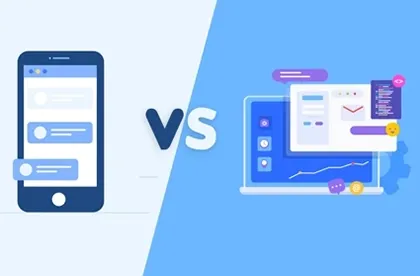
2- Mobile Website Versions
A special version of the website designed for smartphones and tablets is different from the main website and has a different URL. When a mobile version of the website exists and a user wants to view the website from a mobile browser, the user is redirected to the mobile version of the website.
Usually, the mobile version of a website is a simpler version of the desktop version. It works faster, consumes fewer resources, and has less traffic.
Some sections on a webpage may not display correctly due to the small screen size. In this case, developers try to hide these sections so as not to impair the user experience. As a result, websites often hide content visible in the full (desktop) version. For example, when you search on a smartphone, you won't find the results of something you previously searched on Google desktop. Users cannot find information they previously viewed on the desktop.
3- PWA (Progressive Web App)
Progressive Web Apps (PWAs) are web pages or web applications that, like mobile applications, have similar elements for interaction and navigation.
Users download the main structure, save the website icon on their mobile screen, and find the website through it.

4- AMP
Accelerated Mobile Pages (AMP) is an open-source technology created to reduce the download time of web pages even at low network speeds.
Business owners usually keep their websites on their own servers. Depending on the user's location, content delivery takes time. This is problematic when customers live on different continents. Previously, businesses had to place additional servers to match the geographical location of users, which was equal to additional costs, or users had to spend more time viewing the website.
Currently, Google has placed its servers worldwide to increase the viewing speed of pages, and users can download from Google servers in 0.7 seconds.
The AMP algorithm is as follows:

In conclusion, Google invests in development tools to make the mobile internet easier. While responsive and mobile-friendly websites exist, Google is introducing new tools, PWA and AMP, to improve the user experience.
PWA helps to create a website like an application and makes it available offline, reduces download time, benefits from low energy consumption, and is a major advantage for e-commerce.
AMP helps create special pages to download from anywhere in the world in less than a second, meeting the needs of informational pages.