Over the past decade, much attention has been paid to business analytics and data collection. Many marketers believe that the key to a business's success lies in analyzing the data obtained. Only by collecting data can a comprehensive plan be developed for future steps. However, raw, unorganized data can be just as useless as a lack of business analysis.
One of the advantages of operating in the online business sector is that data collection is much easier than in other sectors. Do you know how much data exists in your organization and what its value is? Some examples include:
- Employee check-in and check-out times, leave, delays, overtime, etc.
- Purchase and sales information, payment methods, cost of goods, etc.
- Number of items in stock, their storage time, their real value, etc.
How much of the above data do we use in decision-making? For example, what is the reason for employee overtime (even if no payment is made)? Are employee delays justified? Is the level of inventory in the warehouse reasonable? What is their current value? Has the amount and cost of sales delays been calculated? Or how much damage has been caused by the failure of suppliers to deliver goods on time? And so on...
However, what we intend to discuss in this article is the stage after data collection. When the information has been recorded.
What is meant by optimal management dashboard design?
Optimal management dashboard design means that the management dashboard can provide information to the site manager in the shortest possible time.
Data is everything you need to manage your business. Therefore, it must be available to you in a short period.
The 5-Second Rule in Optimal Management Dashboard Design
Don't forget reports when designing an optimal management dashboard. The 5-second rule tells us that the required information should be available within 5 seconds. Therefore, it is necessary to have access to the main reports in the dashboard.
Some reports that should be considered in optimal management dashboard design:
Number of users
Number of new users
Gender of users
Age range of users
Total daily visits
Total weekly visits
Total monthly visits
Daily sales
User engagement
Current survey report
….
Website management panel reports can vary based on website activity. For example, if you have an online store, it's important to know your daily sales.
Or for content-focused websites, daily visits will be important.
Principles of Management Dashboard Design
Principle #1: Keep it Simple
Simplicity in website management panel design ensures that information is available in less time. Therefore, minimal designs are usually used for management panel design. The key to effective communication with your dashboard is to present your data as simply as possible. You don't need to decorate it to make the dashboard more interesting, and it's best to have a dashboard with minimal coloring and formatting.
Principle #2: Eliminate Unnecessary Chart Elements
Remove gridlines: Gridlines (both vertical and horizontal) are almost always unnecessary in dashboards. The implied reason for gridlines is to aid the viewer in visually assessing the data point. However, people typically assess a data point's value by comparing its position to other data points in the chart; thus, these lines are secondary reference points that simply waste ink.
Remove borders: You will find that removing borders and frames makes your charts cleaner and helps avoid the use of confusing lines when placing multiple charts with borders in a dashboard. Instead of borders, use white space between charts as implied borders.
Avoid overusing trend lines: It is rarely the case that a trend line provides insight that the data chart [2] or a simple label wouldn't communicate. In fact, trend lines often give the reader the impression that the data is a small subset of other data sets. Why have a trend line on a line chart when the line chart itself is a type of trend? Instead of trend lines, the overall trend of the data can be communicated with a simple label.
Avoid unnecessary data labels: You don't need data labels on every chart. Simply plotting the data (without data labels) is enough. You'll find that charts that only show the data pertinent to their message have a bigger impact.
Don't write chart notes if you don't have to: When you are simply plotting a series of data points, you do not need a chart note in the empty space of the chart. Let the title of your chart explain the data.
Remove axes that don't add value: The purpose of X and Y axes is to assist in a visual representation of the scale and position of data points on the chart. However, if the nature and purpose of the chart does not require a particular axis, remove it. Note that the purpose here is not to cripple your chart but to ensure that the chart only contains elements that directly contribute to the main message of your chart.
Principle #3: Limit Each Dashboard to One Viewable Screen
A dashboard should provide a concise and useful (at-a-glance) view of key indicators related to a process or business. This means that all information should be immediately viewable at one time. Although having all data on one viewable screen isn't always the simplest solution, it is often the best. You can compare sections easily and experience more effective relationships, and rely less on short-term memory (you have long-term information available). When a user has to scroll right, left, or up and down, these benefits are diminished.
Principle #4: Use Layout and Placement to Draw Attention
You will often want to highlight one component of your dashboard over others. Instead of using bright colors or variations in font sizes, you can use the leverage of placement and layout to highlight one component of your dashboard over others. Various studies have shown that readers have a natural tendency to focus on particular areas of a document. For example, researchers on one project found that readers view a page as a series of areas, and they pay more attention to certain areas on the page.
They use the diagram below to show what they call "priority areas [1]". They use the figure below to show what they call "priority areas [1]". Areas numbered 1 in the diagram appear to be high priority and attract the most attention for a longer period of time. Meanwhile, areas 3 appear to be less important.
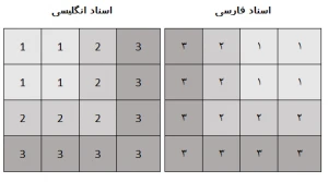
You can use these priority areas to increase or decrease the importance of dashboard components. If one of the charts in your dashboard requires particular focus, you can place that chart in a more prominent area. Of course, surrounding colors, borders, fonts, and other formatting can influence your reader's viewing patterns.
Principle #5: Format Numbers Effectively
No doubt, you will use many numbers in your dashboards. Some will be in charts and others in tables. Remember that every piece of information in your dashboard should have a purpose. It's important to format your numbers effectively so that users can read the information without confusion. When formatting numbers in dashboards and reports, note these guidelines:
- Always use commas to make numbers easy to read.
- Use decimal points only when a high level of precision is needed.
- Only use currency symbols (like $) when necessary to emphasize a point about monetary values. If a chart or table contains all revenue values and a label clearly shows this, you can save cells and pixels by omitting the currency symbol.
- Write very large numbers in thousands or millions. For example, instead of showing 16,906,714, you can write the number as 17 million.
Principle #6: Use Titles and Labels Effectively
Many people don't label items effectively in dashboards. If your user looks at your dashboard and asks, "What is this dashboard about?", your dashboard probably has a labeling problem.
Conclusion
To have an optimal management dashboard, first find the reports that are important to you, make sure that this data can be collected and analyzed through the website. Consult with the website design and programming team to reach a common reporting and display method, and then entrust everything to your web developer. In the end, you will have a management panel that reports everything about the progress and challenges of your online business.